Highlighting the 2022 Colors of the Year
The days are getting longer, birds are chirping, buds are getting closer to making an appearance and spring is in the air. With the fresh revival that comes with this season, it’s easy to have feelings of renewal and soft visions of the lavender fields of Provence. Adding color to your favorite spaces is the perfect way to freshen your surroundings and start the year off with a clean slate. The 2022 colors of the year have been selected by all the major paint brands and the top contenders complement the vibe of spring perfectly! The palettes selected are alarmingly similar – soft shades that invoke refreshment and health, complemented with grounding neutrals that provide a centering effect that bring hope and serenity. 
Colors featured from left to right in color bar.
Dutch Boy: Cypress Green | 424-4DB
(Warm green, mid-tone color)
This nature-inspired olive green brings the grounding security of nature inside your home. Pairing well with both warm and cool color palettes, this option can make for a fantastic accent wall and will certainly add a grounding, soothing effect to your home.
Photo cred: Dutch Boy
Behr: Breezeway | MQ3-21
(Green undertone)
Breezeway easily can make you feel like you’re by the seaside, with a soft breeze blowing and the smell of salt in the air. This color is peaceful and relaxing, yet adds a cheerful element as well. Easily combine with shades of white, gray and earthy wood elements to create a serene space.

Photo cred: Behr
Glidden: Guacamole | PPG1121-5
(Yellow undertone)
This color can remarkably make a room feel lively or soothing. The zenful energy it gives off allows for a rejuvenating atmosphere, while also not feeling too drab or dull.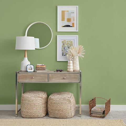
Photo cred: Glidden
Pantone: Very Peri | 17-3938
The last two years have been considerably difficult and most of us have grown tired of feeling constrained. This exciting, surprising color choice encourages playful experimentation and creativity – providing a fun, spirited element to your home. Used either as a wall color or for accent pieces, it is sure to cheer up any space. This modern selection allows us to embrace exciting possibilities, while encouraging joy and imagination.
Photo cred: Benjamin Moore
Benjamin Moore: October Mist | 1495
(Dusty, warm sage)
A whimsical, yet sturdy soft sage hue. The possibilities with this color are endless, working harmoniously with many other color palettes and provides an anchoring backdrop to any room.

Photo Cred: Benjamin Moore
Sherwin Williams: Evergreen Fog | SW 9130
(Gray undertone)
This smooth grayish green color is lush and versatile and the subtle shade can easily work for both interior and exterior spaces. It provides a clean, nourishing feel and complements varying decorating styles.
Photo cred: Vintagerevivals.com